

Using Component Properties for Efficiency
After building a component, how do designers use it? The key step to prevent designers from drilling into layers or accidentally breaking things is adding component properties.
Why Component Properties Are Needed
Imagine you've built a button component with text, an icon, and an optional loading state. Without special handling, designers using your component have to go through hoops every time they want to change something: To change button text, they need to double-click inside to find the text layer; to hide the icon, they need to open the layer list, find the icon layer, and toggle its visibility; to swap an icon, they need to click into the button, find the icon instance, then use the instance swap feature... All tedious and error-prone.
Component properties solve this by surfacing common modifications outside. When users select an instance, they can change text, toggle visibility, and swap icons directly from the right panel without drilling into layers.
Four Types of Component Properties
Ardot provides four types of component properties for different modification scenarios.
| Type | What It Controls | Typical Use Case |
|---|---|---|
| Text Property | Text content | Button labels, card titles |
| Boolean Property | Show or hide a layer | Whether to show an icon, whether to show a badge |
| Instance Swap Property | Which nested sub-component to use | Swapping icons, swapping avatars |
| Exposed Nested Instance Property | Surfaces inner component properties to the outer level | Let users change a Button's text inside a Card without drilling in |
Below is how to use each type.
Common Prerequisite: Select the Component Itself
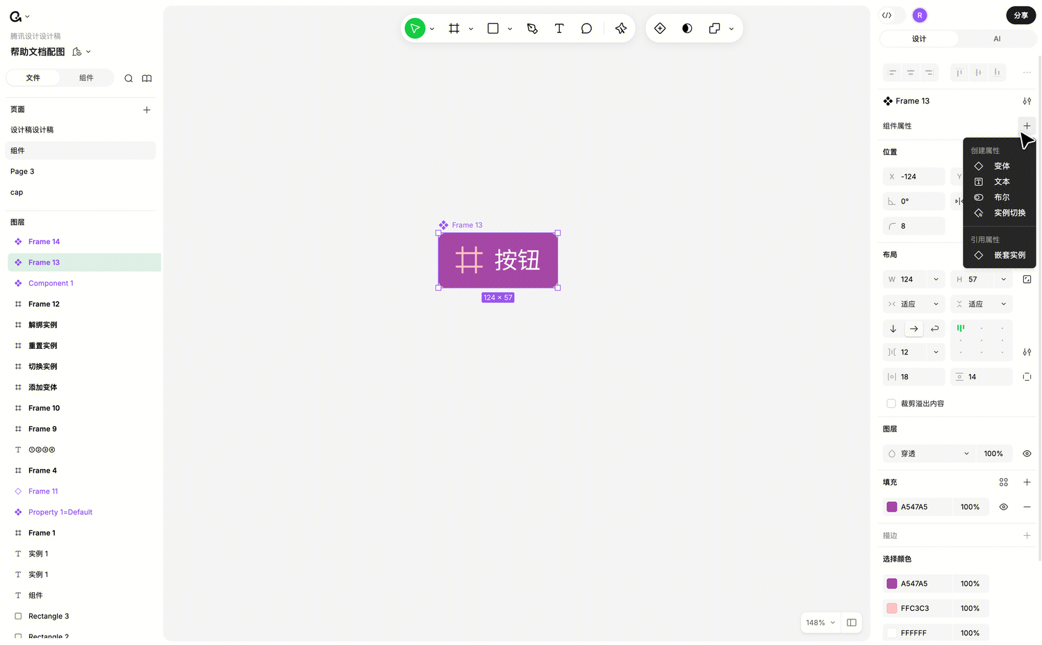
Regardless of which property type you want to create, you must first select the component's outermost level. Not a child layer within the component, not a variant within a component set, but the component itself. For component sets, select the component set.
Once selected, the component properties area appears in the right panel.
Text Property: One-Click Button Label Changes
Text properties control a text layer's content. Button labels, card titles — these are great candidates for text properties.
Creating a Text Property
Recommended: Create directly from the text layer, saving the manual association step.
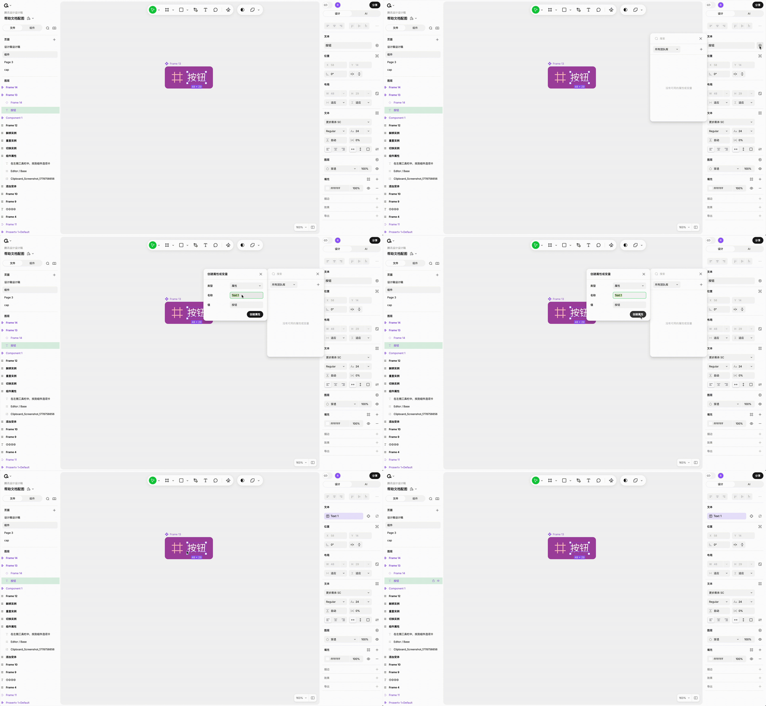
- Select a text layer within the component
- Next to the text content in the right panel, click the Link Variable/Property button
- In the popup menu, click + to create a new component property
- Enter the property name (defaults to Text + number)
- Default value automatically uses the current text content
- Click Create to complete creation and association
Create First, Associate Later
If you prefer to plan all properties first and then bind layers, you can work in reverse.
Select the component's outermost level, click + in the component properties area, choose Text Property, and fill in the name and default value. Properties created this way aren't bound to any layer yet — you need to manually associate them.
The association method is similar to step 2 above: select a text layer within the component, click the link button next to text content, and choose an existing property from the list.
How to Know It's Associated
After successful binding, a purple property tag appears next to the text layer's property. This indicates it's bound.
Boolean Property: One-Click Icon Visibility
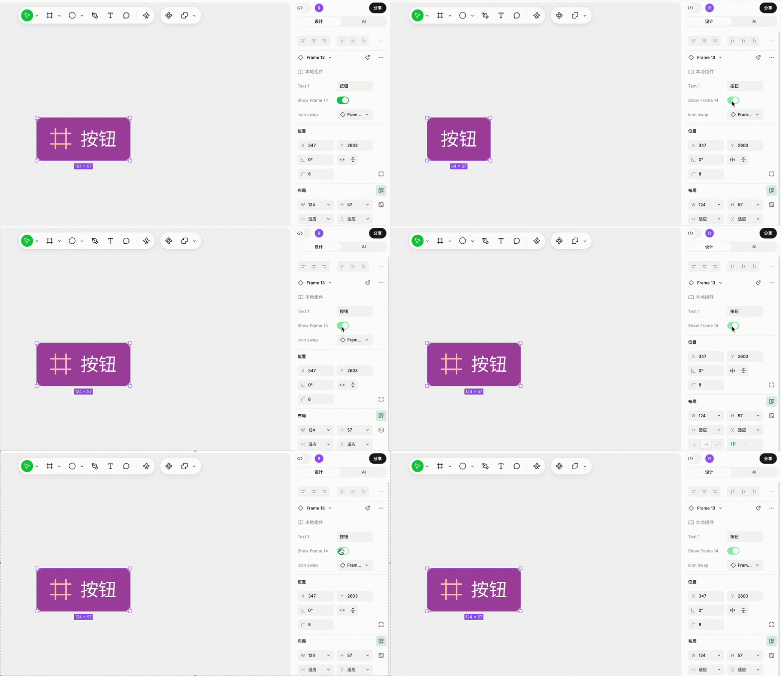
Boolean properties control a layer's visibility. For example, a button component has a loading icon that's normally hidden but shown during loading state. Binding this layer's visibility to a boolean property lets users toggle it with one click in the instance panel.
Creating a Boolean Property
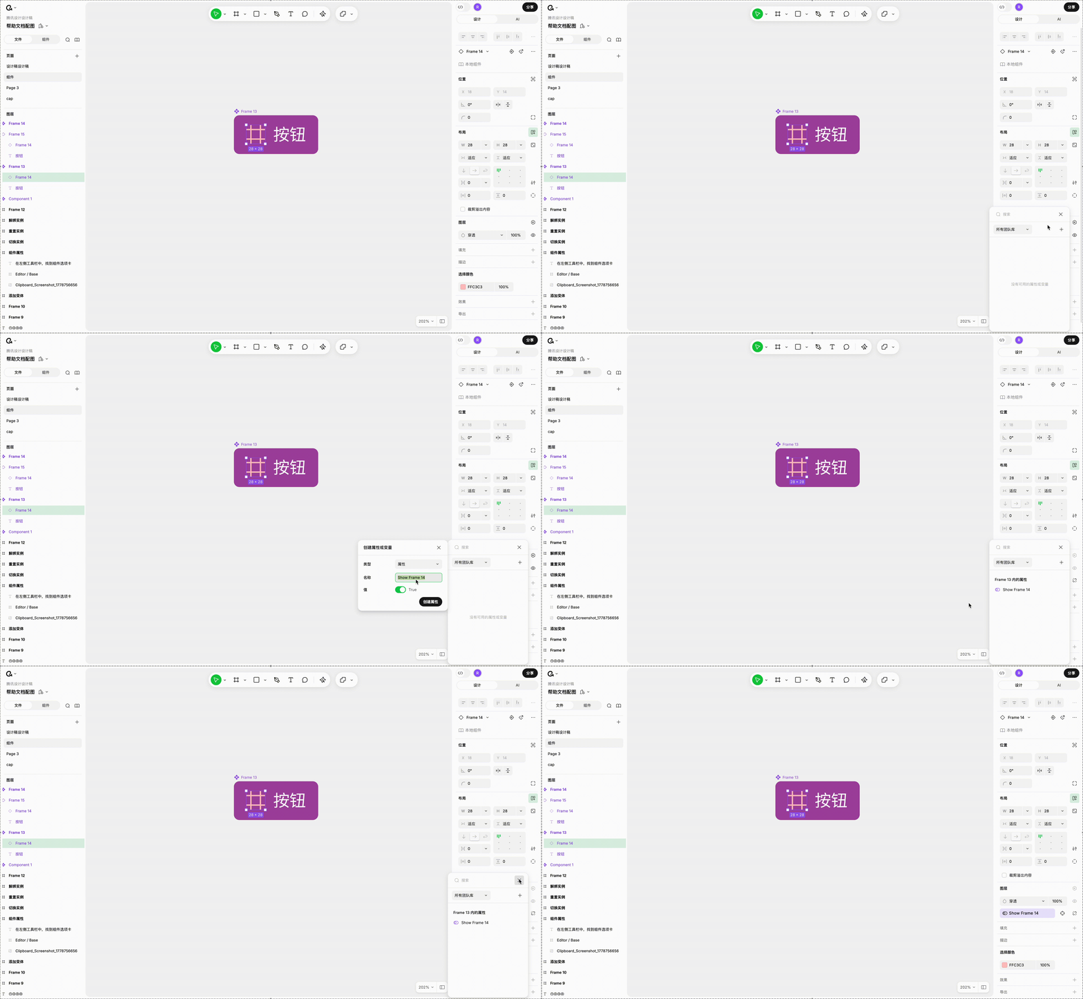
- Select the layer whose visibility you want to control
- In the right panel's layer area, click the Link Variable/Property button next to the eye icon
- In the popup menu, click + to create a new boolean property
- Name defaults to "Show" plus the layer name
- Default value automatically uses the layer's current visibility state
- Automatically bound after creation
Create First, Associate Later
Same approach: select the component's outermost level, click + in the component properties area, choose Boolean Property, fill in name and default value (true or false).
Then select the layer to control, click the link button next to the eye icon, and choose an existing boolean property.
One Property Can Control Multiple Layers
A single boolean property can be bound to multiple layers, making them all show/hide together. For example, a button with "prefix icon" and "icon background" layers can both be bound to the same boolean property.
Instance Swap Property: Let Users Change Icons and Avatars
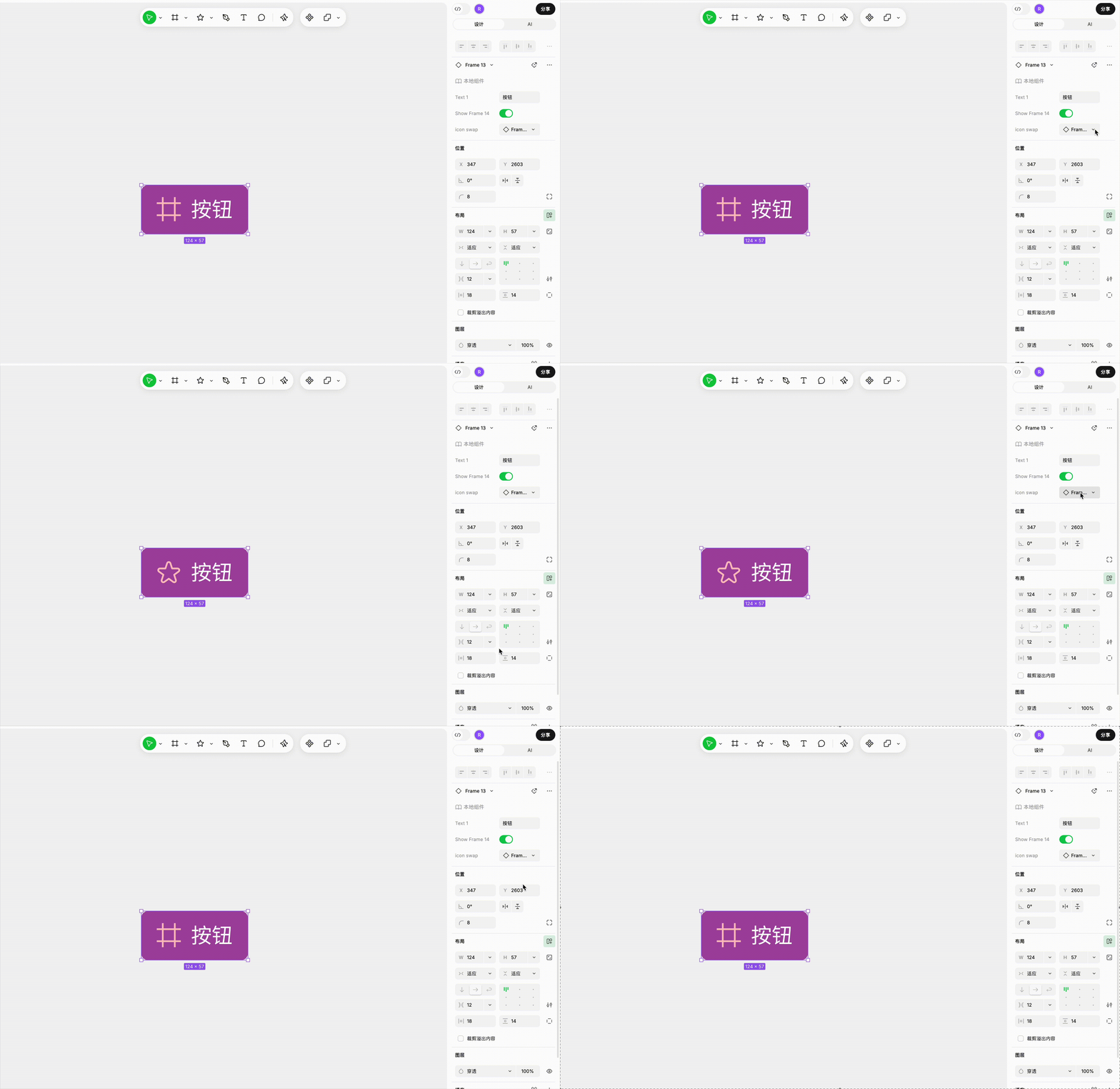
Instance swap properties allow nested sub-components to be replaced with another component. For example, a card component with a nested avatar component — users can swap the avatar for a different shape or style through this property.
Creating an Instance Swap Property
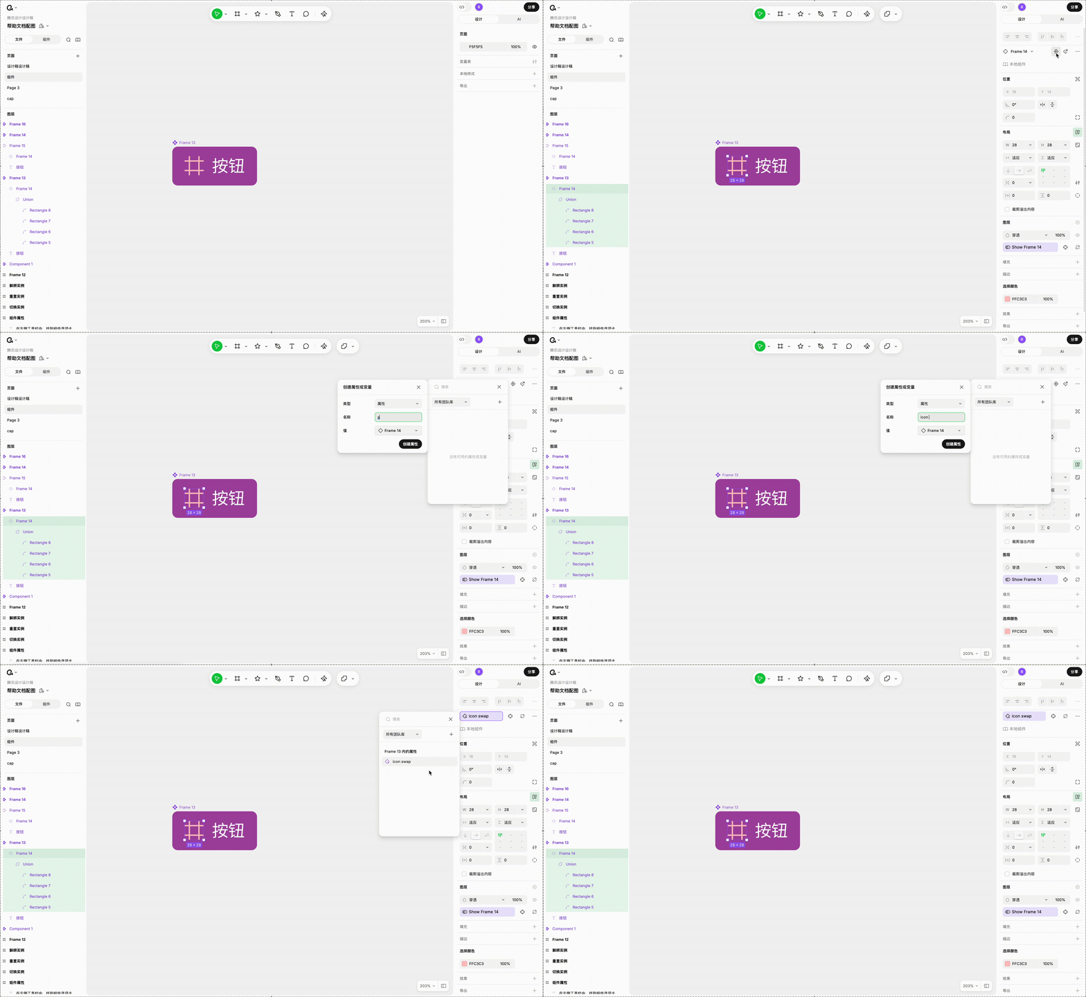
- Select the nested instance within the component (must be directly nested, not one level deeper)
- Click the corresponding button next to the instance swap dropdown
- If instance swap properties already exist in the component, choose from the list or create a new one
- If none exist, the creation dialog opens directly
- Default value uses the current instance
- Automatically bound after creation
Create First, Associate Later
Select the component's outermost level, click + in the component properties area, choose Instance Swap Property, name it (defaults to Instance + number), and select a default component to display.
Then select the nested instance, click the link button next to the instance swap dropdown, and choose an existing property.
About Nesting Levels
The instance to be bound must be directly nested within the component. If an instance contains another instance, the deeper level cannot be directly bound to the current component's properties. To expose deeper content, see the next section on "Exposed Nested Instance Properties."
Exposed Nested Instance Properties: Making Usage Easier
When Is This Needed
Suppose you've made a Card component with a nested Button instance. The Button has its own "button text" property.
By default, designers using the Card who want to change the button text need to: select the Card instance, double-click inside, select the Button instance inside, then change the text in Button's property panel.
Exposed nested instance properties simplify all of this. When selecting the Card instance, Button's properties appear directly in Card's property panel for one-click modification.
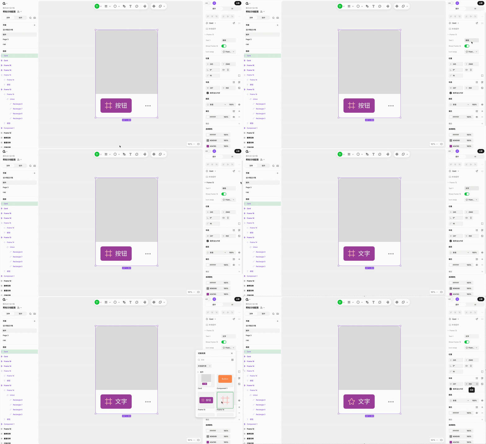
Steps
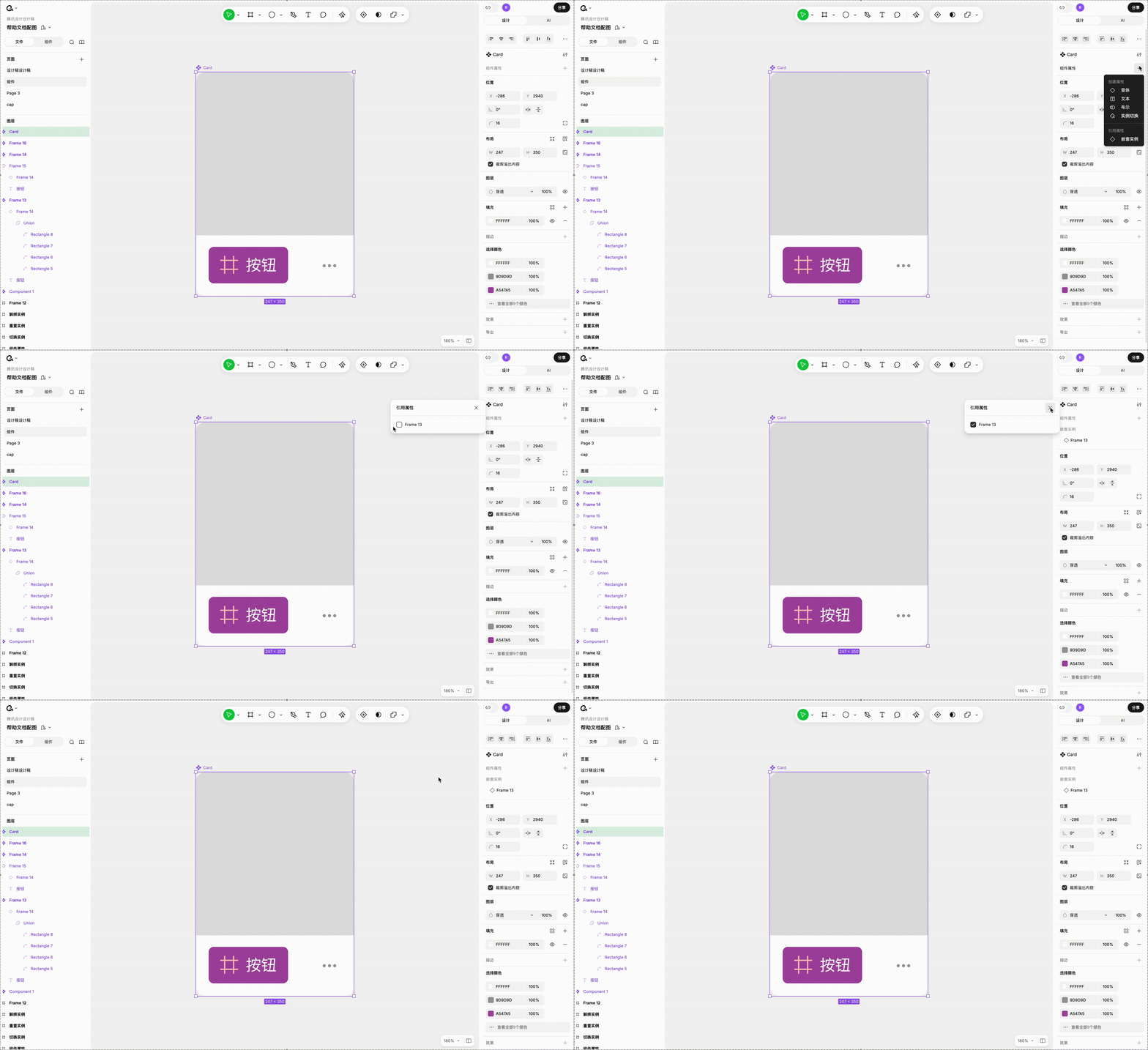
- Select the component's outermost level
- Click + in the component properties area
- Select Nested Instances at the bottom of the menu
- Check the nested instances you want to expose
- Takes effect immediately after checking
What Name Is Used
Exposed properties use the nested instance's layer name in the layer list, not its original component name.
For example, a Button component has an icon whose component name is "up," but you renamed the layer to "icon" in the Card component. The exposed property will display as "icon."
With multiple nesting levels, the name is determined by the layer name in the immediate parent's main component.
Multi-Level Nesting Only Needs One Check
If Card nests Button, and Button nests Icon, you only need to check Button at the Card level.
After exposing, the Card instance's property panel displays all levels' properties in a flat layout — Button's own properties and Button's internal Icon properties are all listed together, so users don't need to drill down level by level.
Hover Highlight
Hovering over an exposed property highlights the corresponding nested instance on canvas, helping you locate it.
Copy Behavior
Copying an instance with exposed properties preserves those exposed properties in the copy, behaving the same as regular component properties.
Managing Your Component Properties
Unassociated Properties Get a Warning
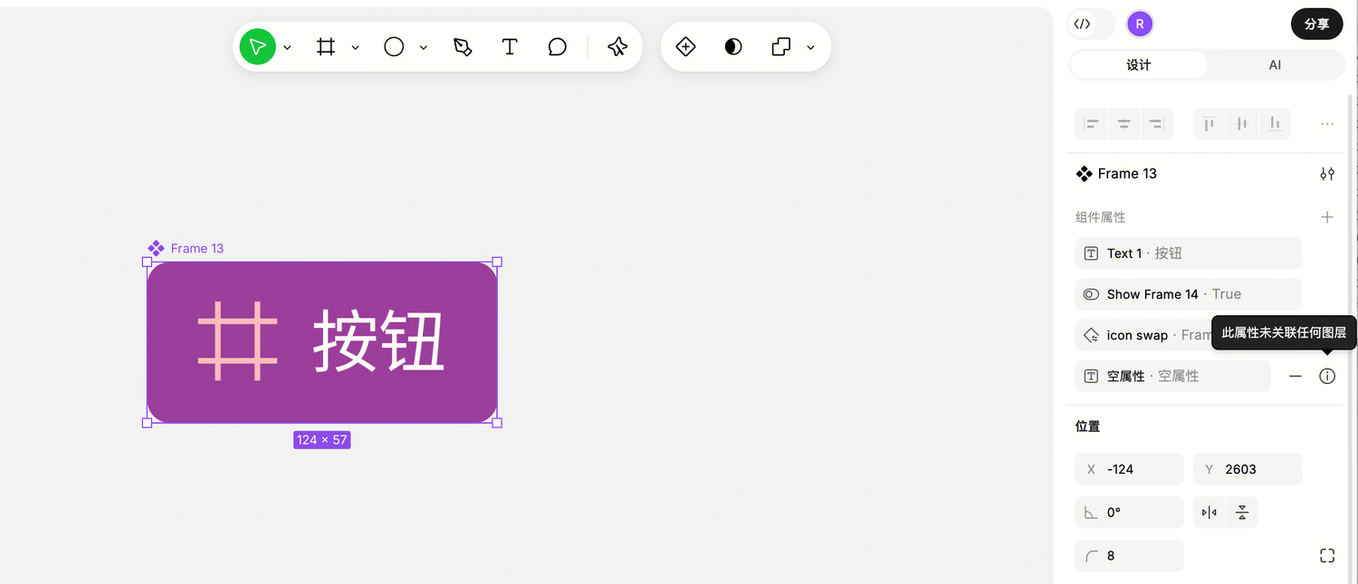
If you create a property but forget to associate it with any layer, you'll see a warning on its right side. Unassociated properties won't appear in the instance panel — remember to associate them.
Editing Properties
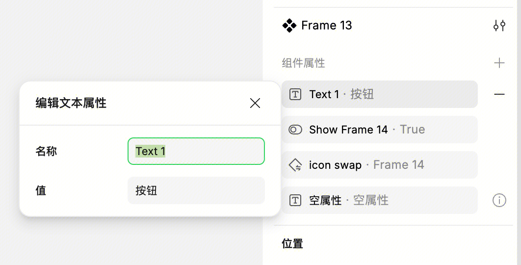
Click the property tag to modify the name and default value. Changes sync in real-time — all layers and instances using this property will update accordingly.
Deleting Properties
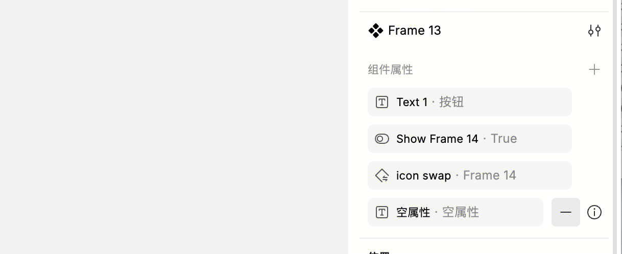
Click the delete button to the right of the property tag. After deletion, previously bound layers will be automatically unlinked — the layers themselves aren't deleted, just the property relationship.
Sorting
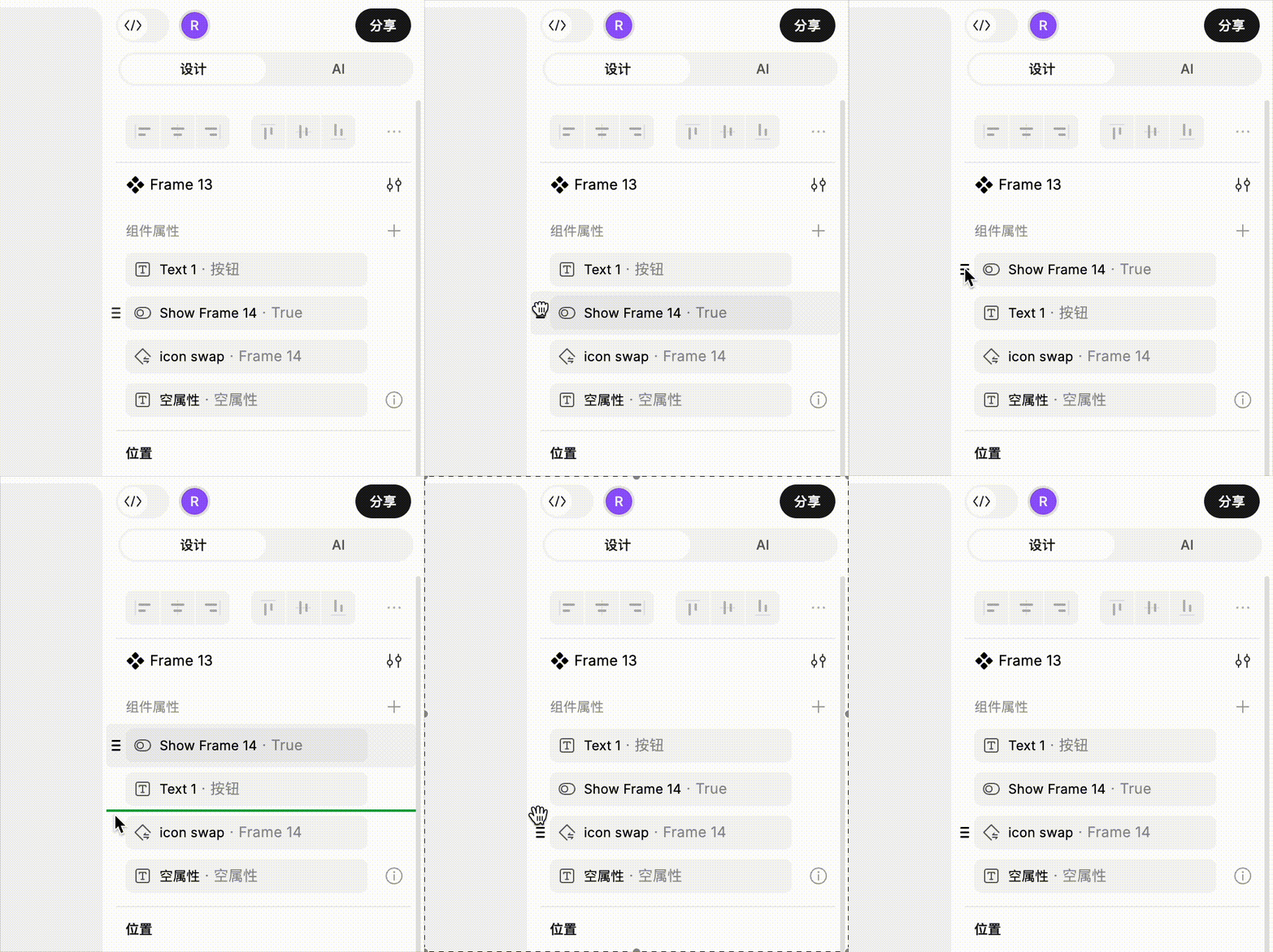
Property order affects the display order in the instance panel — put frequently-changed properties first for better usability. Variant properties and other properties are sorted separately (two areas). Drag property bars to sort. Multi-select with Command for individual selection, or Shift for range selection.
Finding Which Layers Use a Property
Hover over a property tag, and all layers bound to this property will highlight on canvas, making it easy to check.
Unlinking
If a layer no longer needs its property binding, click the unlink button on the right side of the purple property tag. The layer is preserved — just no longer linked to the property.
Changing Associations
To bind to a different property, click the purple tag and select a different one.
Using Component Properties on Instances
Select Instance to Modify
After selecting an instance, the right panel shows all component properties — just interact directly.
- Text property: Edit text in the input field
- Boolean property: Toggle the switch
- Instance swap property: Select another component from the dropdown
- Exposed nested instance properties: Directly operate all inner instance properties, including variant switching
When a Bound Layer Is Selected
If you select not the instance itself but a layer inside that's bound to a component property, the layer's original property is taken over and can't be directly modified here. Instead, you'll see a "Go to Property" button — click it to jump to the instance level to make changes. Layer visibility can still be controlled in the layer list regardless.
When Properties Auto-Hide
In some cases, component properties won't appear in the instance panel.
One case: all layers bound to that property are hidden. If all corresponding layers are invisible, there's no point showing the property.
Another case: the current variant doesn't have layers associated with that property. For example, if a property is only bound to the Primary button variant, instances of the Secondary button variant won't show this property.
This is to prevent users from seeing meaningless options.