

Managing Component States with Variants
A button might have "default/hover/disabled" states, three sizes, and primary/secondary color themes — that's 18 combinations. Do you need 18 separate components? Variants solve this problem.
What Are Variants
Variants let you organize multiple versions of the same component together, distinguishing them by properties.
For example, your button has these versions:
- Default, hover, and disabled states
- Large, medium, and small sizes
- Primary and secondary styles
Without variants, you'd need 18 independent components. With variants, you only need one "Button" component set containing 18 variants, each identified by three properties: State=Default, Size=Medium, Style=Primary.
Designers can switch directly from a dropdown in the instance's properties panel without searching for another component in the library.
Key Terminology
| Term | Definition |
|---|---|
| Component | The reusable element we introduced earlier. A button, a card — these are components. |
| Variant | A different version of the same component. For example, "primary button hover state" is a variant. |
| Component Set | The "container" holding all variants, marked with a purple dashed border on canvas |
| Variant Property | The dimension that distinguishes variants, like "State" or "Size." Each property has different "values," like "Default," "Hover," "Disabled" |
Two Ways to Create Variants
Method 1: Expand from a Single Component
Best for starting from scratch: you've just finished a button component and want to expand it into multiple variants.
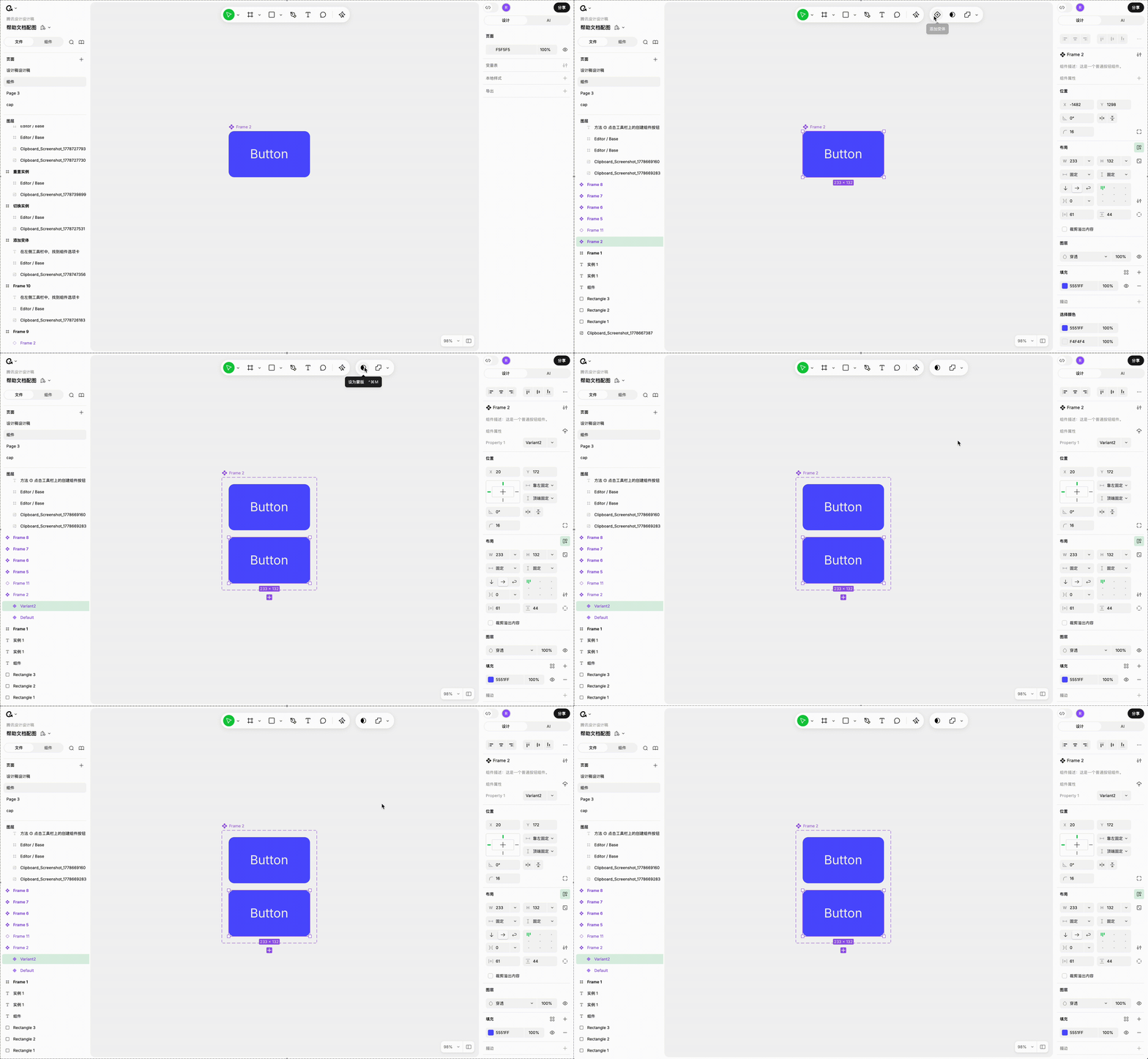
- Select a component
- Click "Add Variant" in the top toolbar
Ardot will automatically:
- Upgrade the single component to a component set (wrapped in a purple dashed border)
- The original component becomes the first variant, labeled
Property 1=Default - Duplicate a second variant, labeled
Property 1=Variant 2, with the input field auto-activated for renaming
Next, just modify the second variant's style (e.g., change to hover state) and rename the properties as needed (e.g., "Property 1" to "State," "Variant 2" to "Hover").
Method 2: Merge Existing Components
Best when you already have a bunch of similar components and want to combine them:
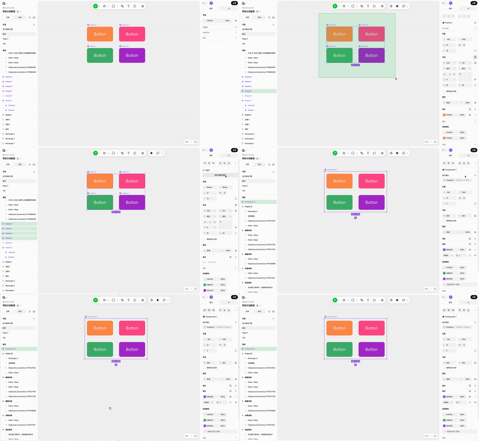
- Select multiple components
- Click "Combine as Component Variants" in the right properties panel
Adjusting Variant Properties
Variant properties are like Excel column headers — they define the dimensions used to distinguish variants.
Adding New Properties
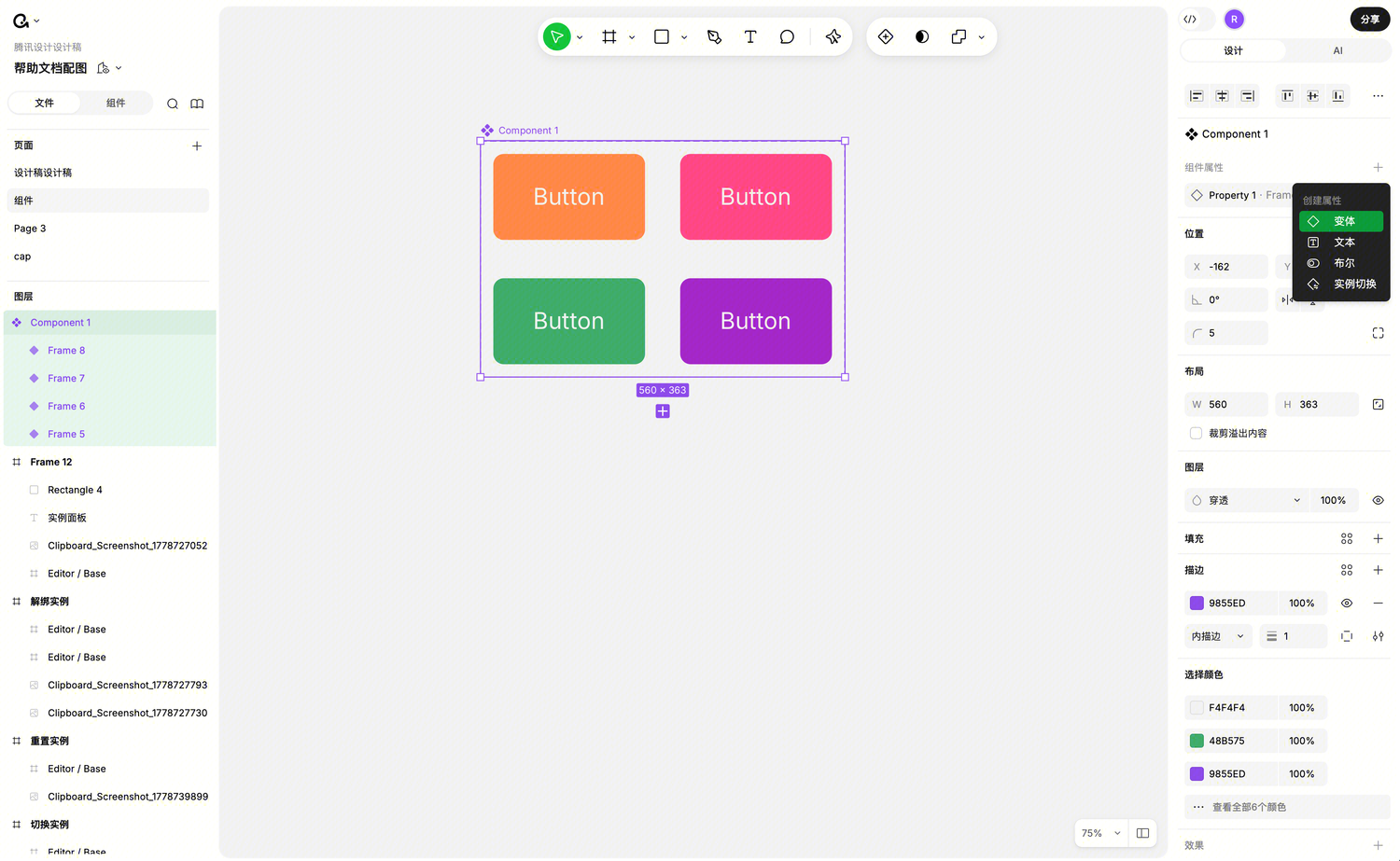
Select the component set, find "Variant Properties" in the right panel, and click "+" to add.
Type the name directly in the field, press Enter to confirm, Esc to cancel.
Renaming Properties
You can rename in two places:
- When component set is selected: Click the property item in the variant properties area → a secondary panel opens for editing
- When a variant is selected: Click the property name directly to edit
Reordering Properties
Property order affects the order shown in the right panel when using instances. Put the most important, frequently-switched properties first (e.g., "State" before "Size").
Action: Hover on the left side of a property item, a drag handle appears — drag to reorder.
Deleting Properties
Hover on a property item, a "-" button appears on the right — click to delete. Deleting a property removes it from all variants.
Adjusting Property "Values"
Properties are dimensions; "values" are the specific options within that dimension. For example, under the "State" property, "Default/Hover/Disabled" are three values.
Renaming Values
Open a property's secondary editing panel, click the value you want to rename, and type the new name. All variants using that value will update accordingly.
Reordering Values
Value order determines the order in the dropdown menu when instances switch variants. For example, putting "Default" first means users see the default state immediately.
Action is the same as property reordering: drag within the secondary panel.
Quick-Preview Each Value's Variant
Hover over a value in the secondary panel, and the corresponding variant on canvas will highlight. Click the "locate" button to the right of the value to select and jump to that variant.
Modifying Values on a Variant
Select a variant, and you can use the dropdown in its property area to select existing values, or type a new value.
True/False Properties Become Toggles
If all values of a property fit a "boolean" pattern, Ardot will automatically display it as a toggle switch for clarity. Recognized keywords (case-insensitive):
- True / False
- On / Off
- Yes / No
Adding More Variants
Ways to create new variants:
| Method | Description |
|---|---|
| Copy & Paste | Select variant, copy (Command+C), paste within the component set |
Quick Duplicate (Command+D) | Duplicate with 10px offset |
| Drag Duplicate | Hold Option (Mac) / Alt (Windows) and drag |
| "+" button below variant | Select a variant, click the + below to duplicate the selected variant |
| "+" button below component set | Select the component set, click the + below to create a new variant from the main variant |
Dragging External Components Into a Component Set
Have an existing component you want to add to the set? Just drag it in. Ardot will automatically assign it to the corresponding property values based on its name (split by /).
Dragging Variants Out of a Component Set
Don't want a variant anymore? Drag it out of the component set — it becomes a regular component, with its name defaulting to its "display value."
Adding Descriptions to Component Sets and Variants
Both the component set and each variant can have descriptions:
- When component set is selected: Shows the component set's description (recommended: overall component explanation)
- When a variant is selected: Shows that variant's description (recommended: specific use case for that variant)
- When others select an instance: The corresponding variant's description is shown first
Using Variants in Instances
Only One Thumbnail in the Components Panel
To avoid variants cluttering the panel, component sets show only one thumbnail (based on the main variant).
Switching Variants via Dropdown
After selecting a variant instance, the right panel shows all variant properties for that component set. Each property is a dropdown — select different values to switch to the corresponding variant.
Boolean properties display as toggles for convenience.
Jumping to Main Component
Clicking "Go to Component" in the Instance panel jumps to the currently selected variant, not the entire component set.
If you want to manage the entire component set (e.g., adjust properties), click the "Component Set" icon button in the Instance panel to quickly select the outer component set.
Multi-Select Operations
| You Selected | What You Can Do |
|---|---|
| Multiple components | Combine as variants |
| Multiple variants in the same component set | Batch modify property values |
| Multiple instances | Swap instances |
| Multiple instances of the same component | All instance operations |
Handling Errors
Duplicate Variant Names
If two variants have identical property values (e.g., both are State=Default, Size=Medium), Ardot will warn about a conflict:
- When component set is selected: "Multiple variants have the same property values, please modify to avoid conflicts" — with a button to jump to the conflicting variant
- When a conflicting variant is selected: "This variant's property values conflict with another variant, please modify"
Fix: Change one variant's property values so the combinations are different.
Note: Component sets with conflicts cannot be published to the team library.
Invalid Variant Name Format
Variant layer names must follow the format Property1=Value, Property2=Value. If the format is wrong, Ardot will show an error. Click "Reset Layer Name" to fix with one click.
Similarly, component sets with format errors cannot be published to the team library.
Variant Missing Properties
If a variant's name is missing some properties, Ardot will warn "This variant is missing some properties, please add them" with an icon next to the variant.
Priority When Multiple Errors Occur
If a component set has multiple issues simultaneously, warnings are displayed in this order (fix one before seeing the next):
- Invalid variant name format (highest priority)
- Duplicate variant names
- Missing variant properties