

Components and Instances
What Are Components and Instances
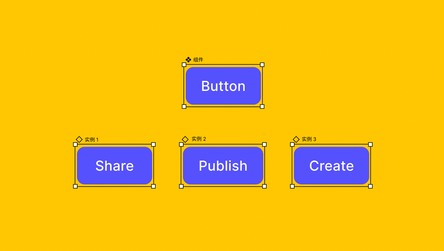
Components are fundamental building blocks in UI design and development — think of them as "modular building blocks" for your designs. In Ardot, a component is a reusable design element — it can be a simple button or icon, or a complex card or modal. Making them into components is like placing them in a "reusable toolkit."
Every time you drag a component onto the canvas, what you place is actually an instance of it. An instance looks the same as the component, but they're not independent copies — there's an "invisible link" connecting them:
- When you update the component, all instances update automatically
- You can make individual modifications to a specific instance (like changing text or colors), and those changes won't affect the component or other instances
This is the value of components: Design once, use everywhere; update once, apply everywhere.
Creating Components
Select Layers and Create
Design the element you want to reuse (such as a button), then select it. Use any of the following methods to create a component: 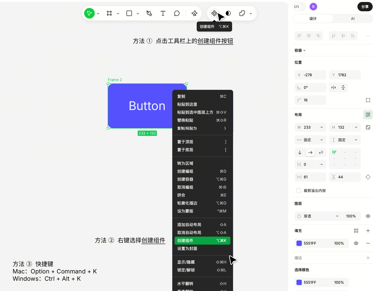
- Click the "Create Component" button in the top toolbar
- Right-click and select "Create Component"
- Use keyboard shortcuts:
- Mac:
Option+Command+K - Windows:
Ctrl+Alt+K
- Mac:
Once created, you'll see the layer turn into a purple component icon in the layers panel — this is Ardot's identifier for components.
What Happens with Different Layer Types
Depending on what type of layer you select, Ardot will wrap the component differently:
- A container (e.g., Frame): Ardot directly converts the container into a component, preserving all contents and settings
- A non-container layer (e.g., rectangle, text): Ardot first creates a container to wrap it, then converts to a component
- Multiple layers: Ardot creates a container to hold them all, then converts to a component. Names are automatically assigned as "Component 1", "Component 2", etc. (unique within the file)
Batch Creating Multiple Components
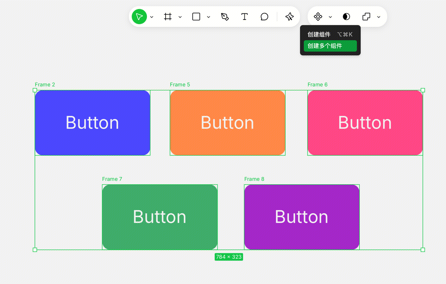
If you select multiple independent layers (e.g., 5 different icons) and want them to each become separate components rather than merged into one — use "Batch Create Components."
Each selected layer (or container, group, boolean group, path) will be individually converted to a component.
Which Layers Cannot Be Made into Components
- Layers that are already components (no need to nest another level)
- Child layers of components or instances (component structure must remain independent)
A Quick Reminder
Once a component is created, it cannot be "undone" back to a regular container — only through Command+Z undo. If you just want to temporarily group something, use regular grouping (Command+G).
Creating Instances
After making a component, there are three ways to use it in your design:
Method 1: Copy the Component Directly (Fastest)
Select the component, Command+C to copy, Command+V to paste, and you'll get an instance.
Other copy methods work too:
Command+Dfor quick duplicate- Hold
Option(Mac) /Alt(Windows) and drag the component
Tip: A component cannot contain an instance of itself (to avoid infinite nesting).
Method 2: Drag from the Components Panel
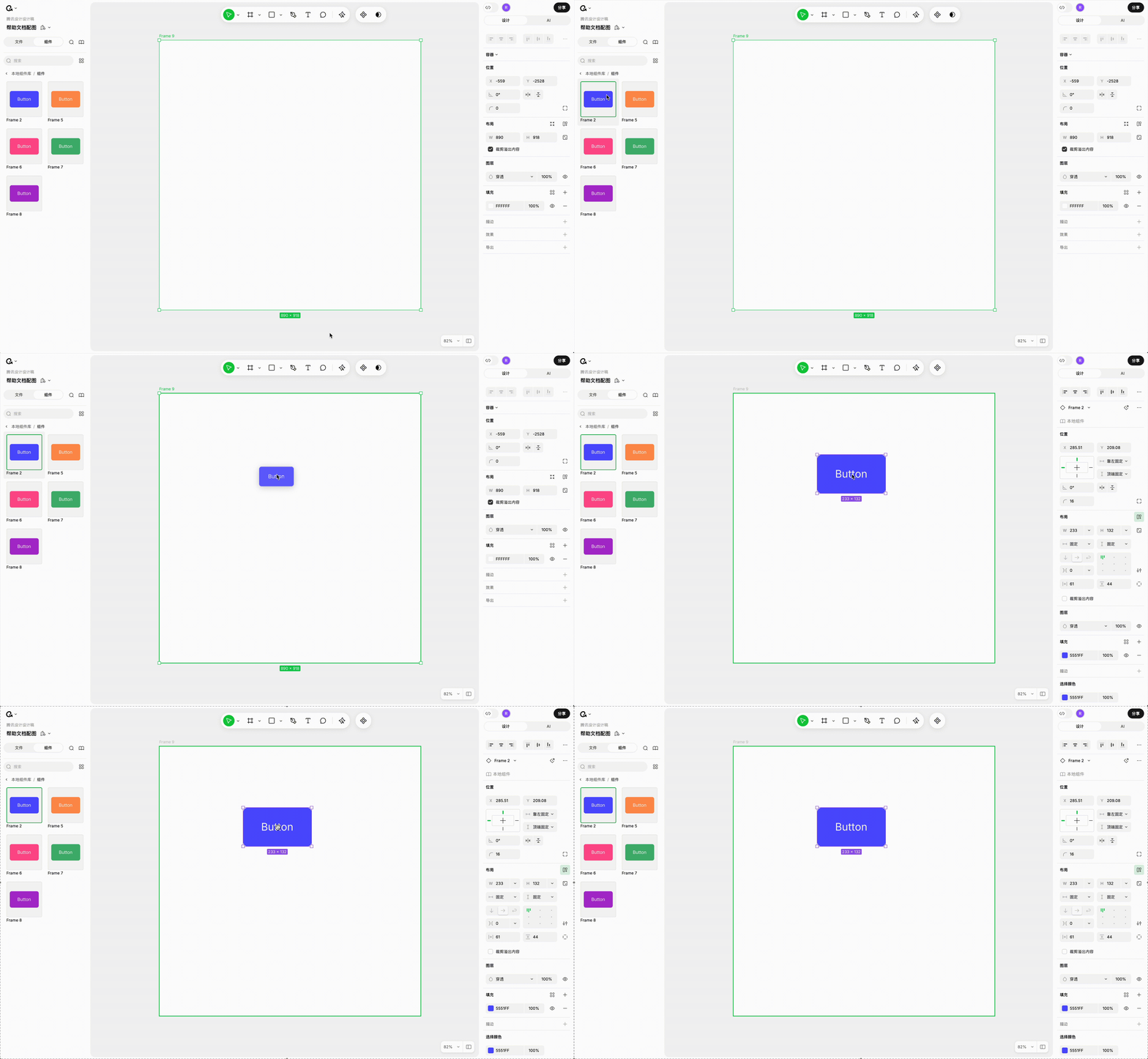
The left sidebar has a "Components" tab (shortcut: Mac Option+2 / Windows Alt+2), listing all components in the file.
Find the component you need in the panel and drag it onto the canvas. While dragging, Ardot will highlight the target container or Section, and the instance will be placed at the corresponding level when you release.
Managing Components with the Components Panel
When your file has many components, the Components panel is the fastest way to find them.
Opening the Components Panel
- Click the "Components" icon in the left sidebar
- Or use the shortcut: Mac
Option+2/ WindowsAlt+2
Grid vs List View
The panel's top-right corner lets you switch between two display modes:
- Grid mode (default): Shows thumbnails, great for visual identification
- List mode: Text list, better when you have many components
Auto-Grouping
The components panel automatically groups components based on their location and naming, with this hierarchy:
- File grouping: First splits into "Local components" (current file) and "Enabled libraries"
- Page grouping: Groups by the page the component is on (skipped if there's only one page)
- Container grouping: Components in the same top-level container or Section are grouped together
- Name grouping: Each
/in a component name creates a sub-group level
Naming tip: Use
/to categorize components, e.g., naming button variants asButton/Primary,Button/Secondary— they'll automatically group underButton.
Managing Components
Naming Components
A component's name is its layer name. Recommendations:
- Use meaningful names so your team can find them
- Use
/for hierarchical categorization (see naming tip above) - Don't use duplicate names within the same file
Adding Component Descriptions
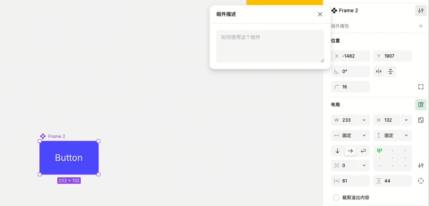
A description is a usage guide for other designers — telling them when and how to use the component.
Steps: Select component → Right panel → Open description dialog → Enter description
Descriptions appear in two places: the Components panel preview, and the Instance panel (visible when others use the instance).
Deleting Components
Simply select the component and press Delete. Deleting a main component won't affect existing instances — instances will maintain their current appearance but lose synchronization with the main component.
If you later want to restore the component, select any instance and find the "Restore Component" button in the Instance panel (see below).
Managing Instances
Instance Panel
When you select an instance, the Instance panel appears at the top of the right panel, showing key information: 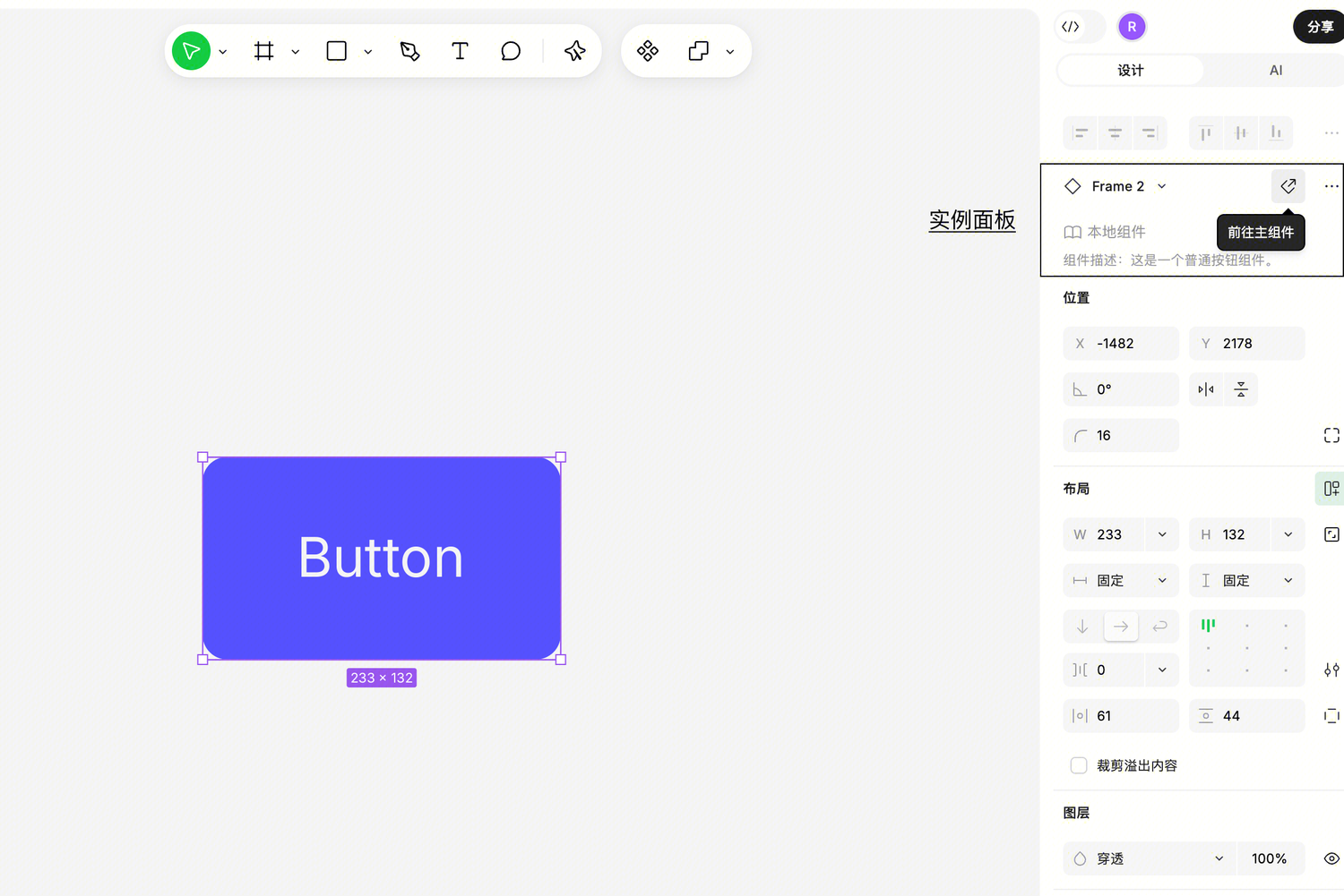
- Component name: Which component this instance was generated from (shows the main component's name, not the layer name)
- Component source: Local / Team library / Organization library
- Component description: Usage notes written by the component author
- Go to Component button
- More actions menu (detach, reset, etc.)
Go to Main Component, Quick Return
Need to edit the main component while working on an instance? Click the "Go to Component" button in the Instance panel — the canvas will jump to the main component and select it.
After editing, a "Return to Instance" button appears in the top-left corner of the canvas — click to return to your previous editing position.
Nested instances are supported too — when selecting an instance within an instance, you can go to its corresponding component.
Restoring Deleted Components
Select any instance of a deleted component, and the "Go to Component" button in the Instance panel will change to "Restore Component". Clicking it will restore the component to its position on the canvas at the time of deletion (at root level) and select it.
Swapping an Instance for Another Component
Sometimes you've used a component but realize another one is more suitable — no need to delete and redo, you can swap instances:
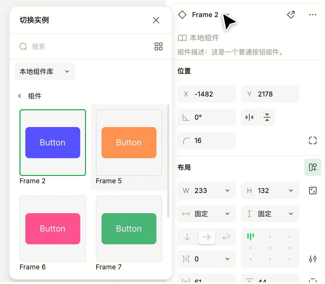
- Select the instance
- Click the component name in the Instance panel
- Choose a new component from the popup list
During swapping, modifications you've made (like text or color changes) will be inherited to the new component using "layer name matching" rules, avoiding repetitive work.
If you try to swap a nested instance with its own parent component, you'll get an error "Component cannot contain an instance of itself" — this prevents infinite nesting.
Detaching Instances (Breaking the Component Link)
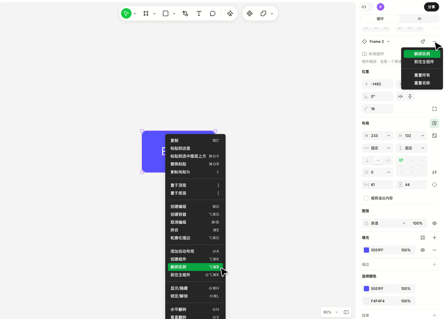
If you want an instance to be completely free and no longer follow main component updates, you can "detach" it:
- Entry: Instance panel → More actions → "Detach Instance"
- Shortcut: Mac
Option+Command+B/ WindowsCtrl+Alt+B
After detaching, the instance becomes a regular container with no relationship to the original component.
Note: This can only be undone via undo. If the instance is nested within another instance, all parent instances need to be detached simultaneously; but child or sibling nested instances won't be automatically detached.
What You Can and Cannot Do Inside Instances
Instances aren't completely free — they must maintain structural consistency with the main component. So there are some limitations inside instances:
You can:
- Change the instance's overall size and position
- Modify colors, text, visibility, and other properties (these modifications are called "overrides" — see the next chapter for details)
- Copy layers out from inside the instance
You cannot:
- Resize or rotate child layers inside the instance
- Move child layers inside the instance
- Paste new layers into the instance
If you need complete freedom to modify the instance's internal structure, first detach the instance to convert it to a regular container.